Bringing the Bookstore’s Name to Life
The goalfor this project was to redesign all the branding for Octopus Books neighbourhood bookstore in a way that expresses the bookstore’s style. Targeted at children, teens, and young adults, this bookstore is perfect for all types of book lovers and enthusiasts. This logo design brings the bookstore’s name to life in a fresh, illustrative style.
Deliverables
- • Branding
- • Logo Design
- • Stationery
- • Website
- • Logo Reveal
Features
- • Distinct
- • Unique
Platforms
- • Illustrator
- • Indesign
- • Photoshop
- • After Effects
Sketching from Start to Finish
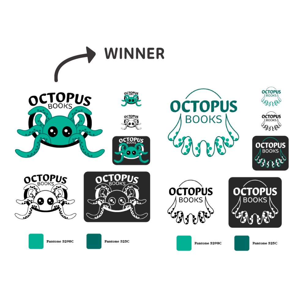
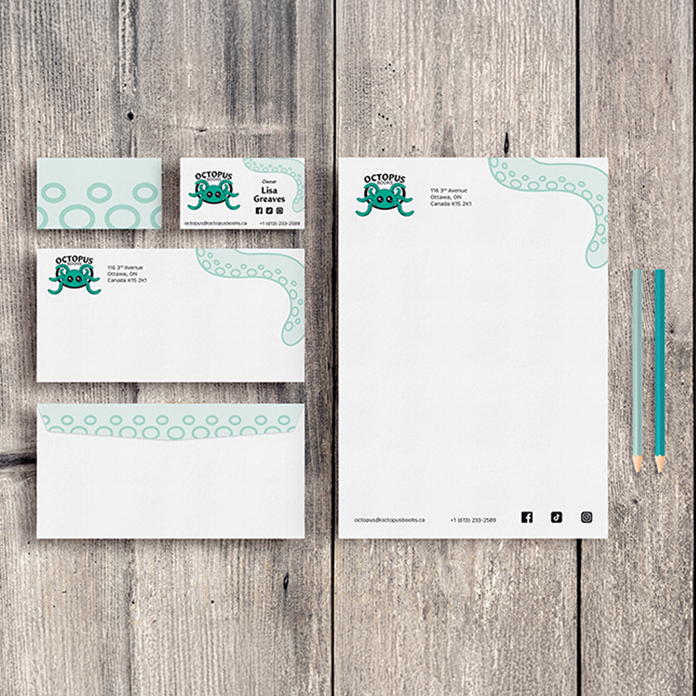
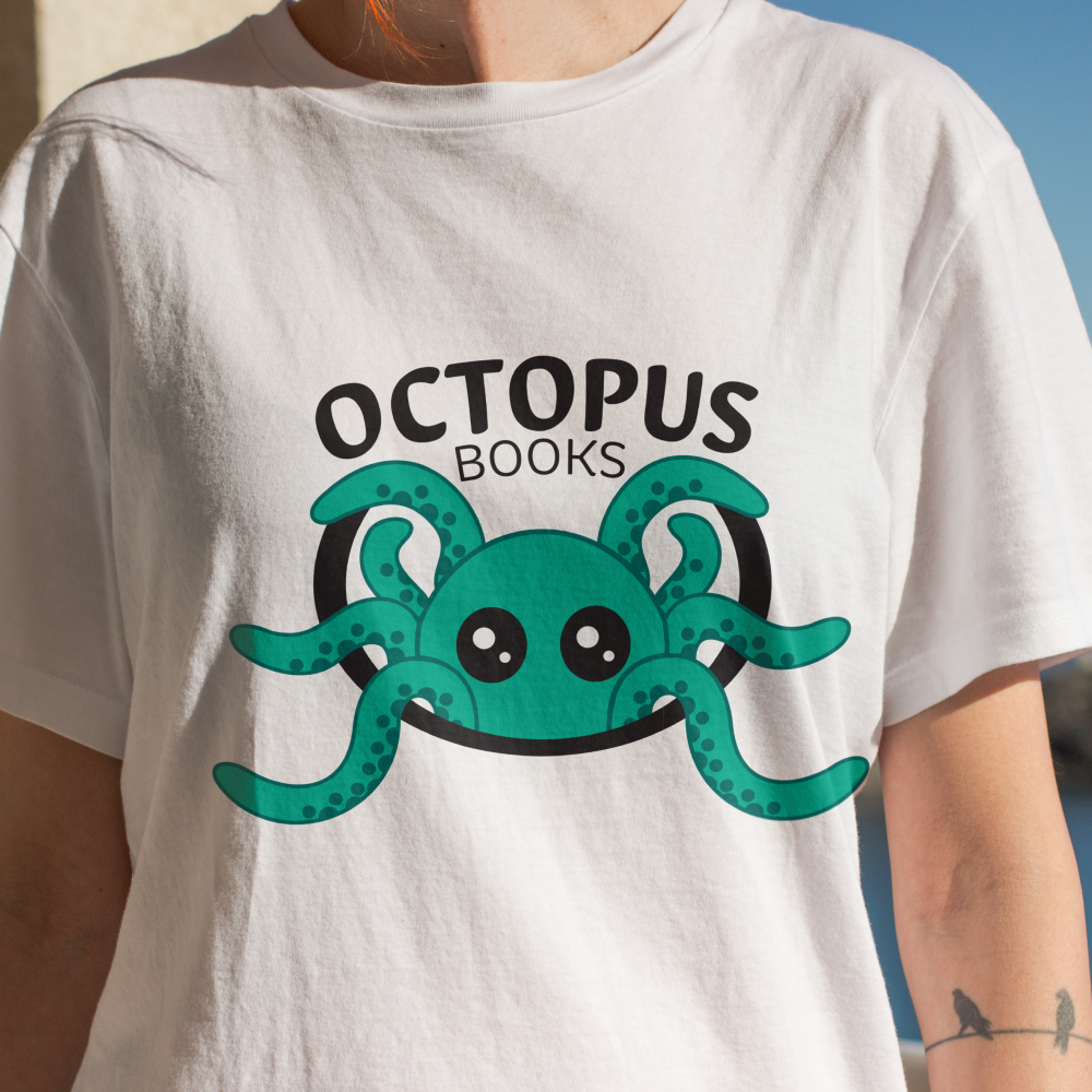
While redesigning the packaging for Octopus Books, the only thing that remained the same was the colour palette, everything else got amake over. The main idea for the logo redesign was to incorporate some part of an octopus, whether that was the entire body, part of it, or only an arm. After doing many different sketches, refinements, and consultations with the client, we landed on two different logos. With some debate between the two, the client chose the more illustrative design they believed it represented them the best.Then came time for the rest of the branding package. We created an entire branding guide for this logo, as well as a website, stationery, and some mock-up applications.

Old Logo vs. New Logo
Scroll Through to See the Progress!
Delivering Personalized Branding
The final design delivers a personalized, distinct, and unique branding package. With consistency across all applications, this bookstore is easily recognizable on any platform. The client was thrilled with the result of this project, noting that the design really represents them well.Looking back, spending more time and enhancing the design of the website could help attract people to the bookstore.


